Sampling Your Posterior

The data
So, we’ve flipped the globe 6 times, and drawn
W,L,W,W,W,L,W,L,W

Grid Sampling
In a data frame:
1. Use seq to come up with a set of possible probability
values
2. Add a column of priors. Make it flat, so they’re all 1, or get
fancy.
3. Calculate your likelihoods for each probability with size=9 and
W=6
4. Calculate your prior * likelihood
5. Calculate your posterior, as the previous value divided by the sum of
all prior*likelihoods
And we’ve made a grid sample
library(dplyr)

# our hypotheses and prior = 1/nrow
grid <- data.frame(prob = seq(0,1,.01),
                   prior=1/101) |>

  #calculate likelihood
  mutate(likelihood =
           dbinom(water, size = 9, prob = prob)) |>

  # multiply by prior
  mutate(posterior = likelihood*prior) |>

  # divide by marginal (normalize)
  mutate(posterior = posterior/sum(posterior))
Note - if rounding error is a problem
# our hypotheses
log_grid <- data.frame(prob = seq(0,1,.01),
                   prior=1/101) |>

  #calculate log likelihood
  mutate(likelihood =
           dbinom(water, size = 9, prob = prob, log = TRUE)) |>

  # multiply by prior
  mutate(posterior = likelihood + prior) |>

  # exponentiate and divide by marginal (normalize)
  mutate(posterior = exp(posterior),
         posterior = posterior/sum(posterior))
How do we query our posterior?
Our posterior
  prob      prior   likelihood    posterior
1 0.00 0.00990099 0.000000e+00 0.000000e+00
2 0.01 0.00990099 8.150512e-11 8.150511e-12
3 0.02 0.00990099 5.059848e-09 5.059848e-10
4 0.03 0.00990099 5.588844e-08 5.588844e-09
5 0.04 0.00990099 3.044058e-07 3.044058e-08
6 0.05 0.00990099 1.125305e-06 1.125305e-07
Our posterior at it’s peak
  prob      prior likelihood  posterior
1 0.67 0.00990099  0.2730674 0.02730674
2 0.66 0.00990099  0.2728850 0.02728850
3 0.68 0.00990099  0.2721339 0.02721339
4 0.65 0.00990099  0.2716211 0.02716211
5 0.69 0.00990099  0.2700592 0.02700591
6 0.64 0.00990099  0.2693188 0.02693188
What does it look like?

Code
How do we query our posterior?
- We could look at all values of the posterior and
calcuate the density
- We could look at the highest posterior or weighted
average
- We could integrate over a selected range and…
AH! Intergrals? No! Samples? Yes!
- Posteriors summarize the frequency of certain
values
- We can leverage that and use our grid sample to
generate an empirical distribution
- This lets us develop an intuitive notion of the posterior, and manipulate it easily
Sampling from your Posterior
Sampling from your Posterior
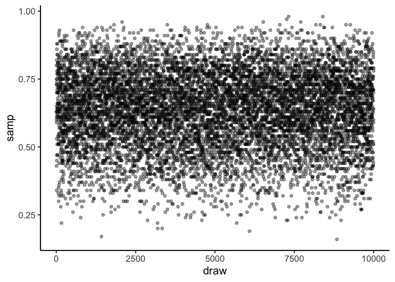
Code
Sampling from your Posterior: MCMC style
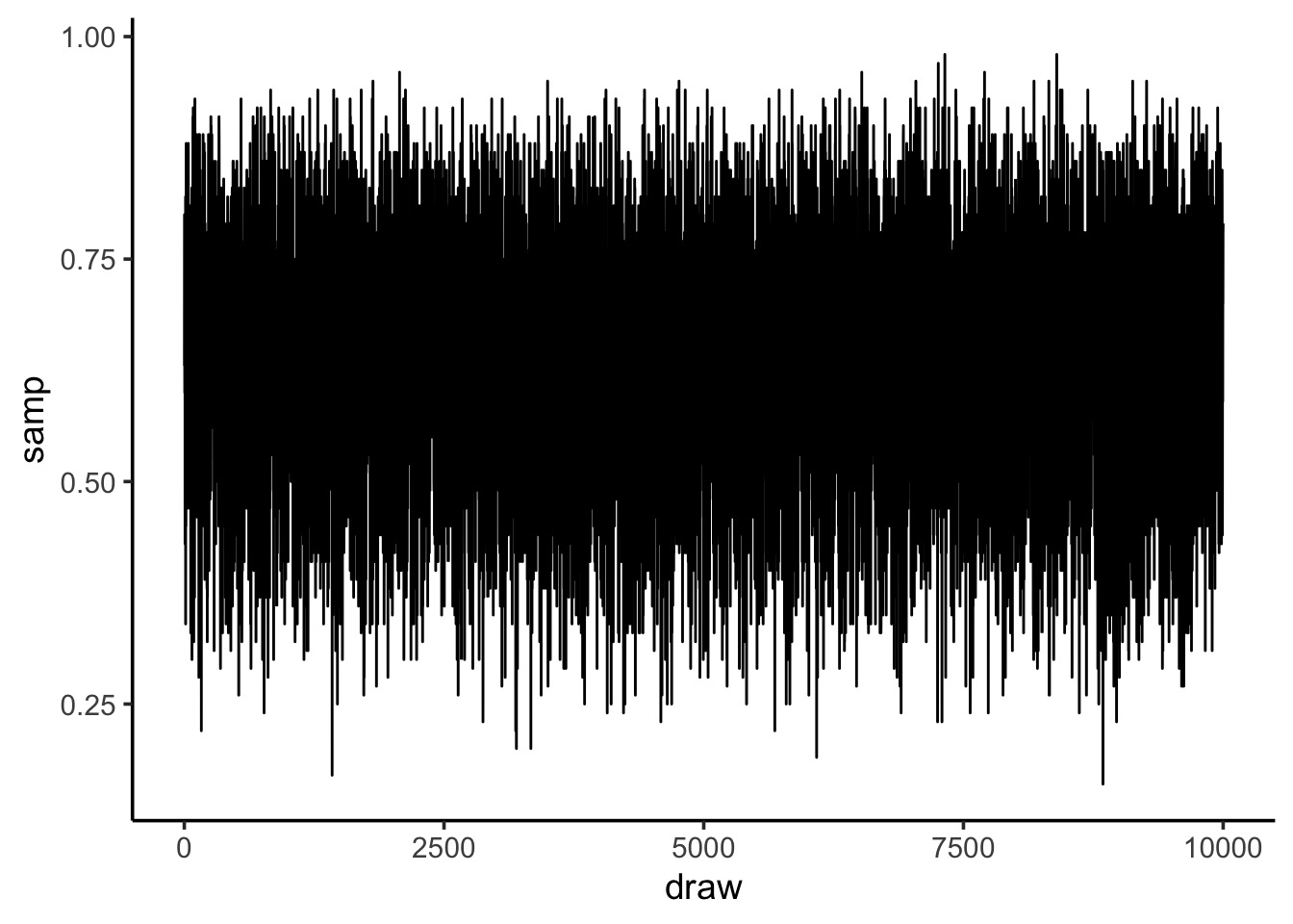
Code
What can we do with this: histogram

Code
Histograms can show weakness of grid
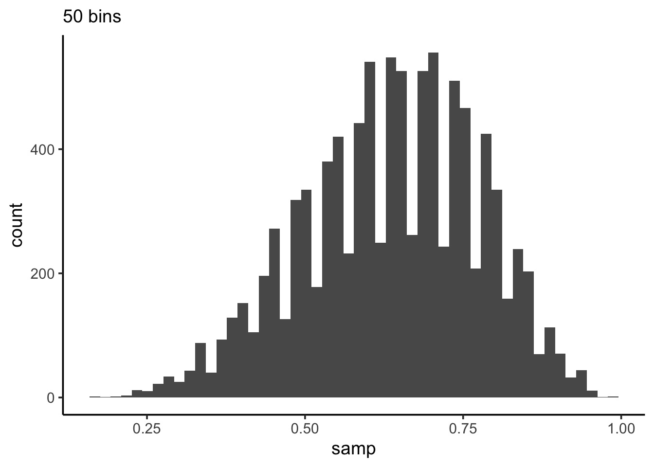
Code
What can we do with this: density
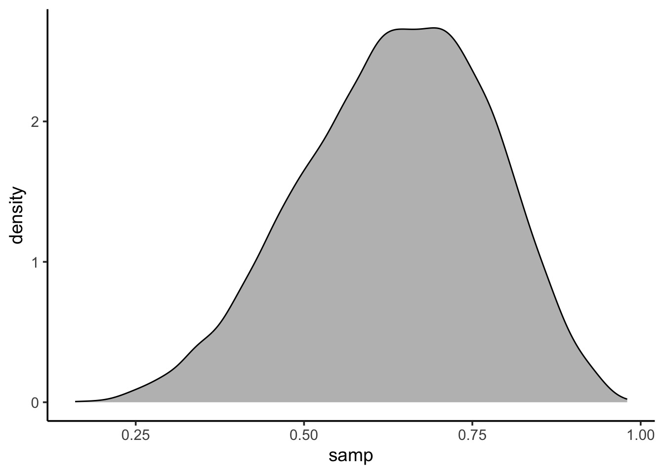
Code
Summarizing a Parameter with a Sample
Summarizing a sample of a posterior: Questions we can ask
How much of the posterior is less than a certain value?
How much of the posterior is greater than a certain value?
What value of the posterior has the highest density?
What is the range of the values of some percent of the posterior? e.g., 90%
Looking at mass < a key value
- Let’s say we wanted the % of the posterior < 0.4
[1] 0.0504So, 5.04% of the posterior
Plotting an Interval

Code:
It’s a filter thang!
Try a few
What % is < 0.6
What % is > 0.6
What % is between 0.2 and 0.6
How do we describe a parameter
- Typically we want to know a parameter estimate and information about
uncertainty
- Uncertainty can be summarized via the distribution of a large sample
- We can look at credible (compatability) intervals based on mass of
sample
- We can look at credible (compatability) intervals based on mass of
sample
- We have a few point estimates we can also draw from a sample
- Mean, median, mode
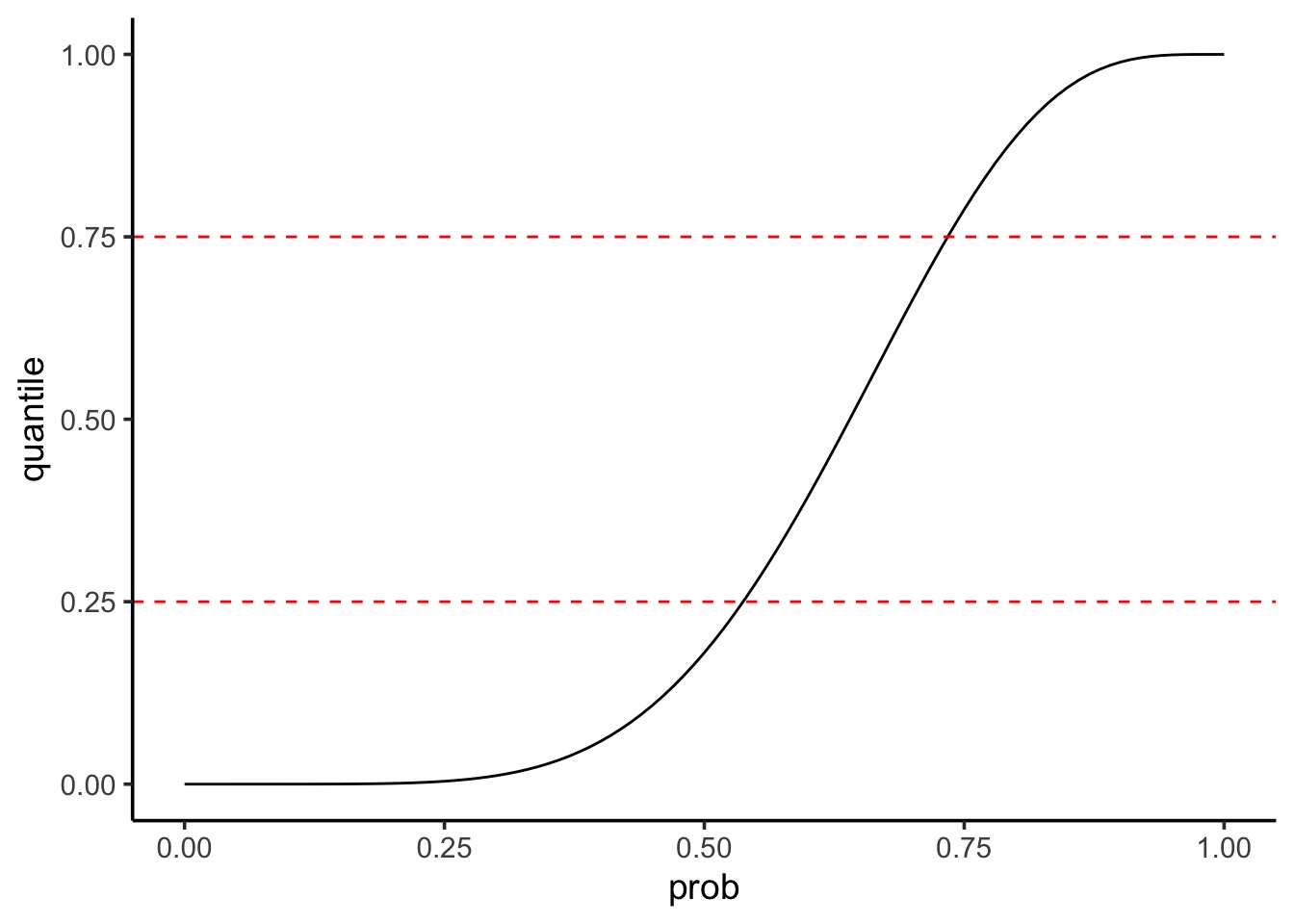
Summarizing Uncertainty: 50th Percentile Interval
Summarizing Uncertainty: Percentiles
We can calculate quantiles using the cummulative density of the posterior
Summarizing Uncertainty: 50th Percentile Interval
Code
Summarizing Uncertainty: 50th Percentile Interval
Visualize as before

Summarizing Uncertainty: 50th Percentile Interval Code
Visualize as before
ggplot() +
#grid posterior
geom_line(data = grid,
aes(x = prob, y = posterior)) +
#the interval
geom_ribbon(data = grid |> filter(quantile > 0.25 & quantile < 0.75),
ymin = 0, aes(x = prob, ymax = posterior),
fill = "black")Note that this is not the Highest Posterior Density Interval
PI v. HPDI
- Percentile Intervals get interval around median that covers X% of
the distribution
- Highest Posteriod Density Interval gets interval with highest density containing 50% of mass of distribution
 25%  75%
0.54 0.74 |0.5 0.5|
0.54 0.73 PI v. HPDI for a Skewed Distribution
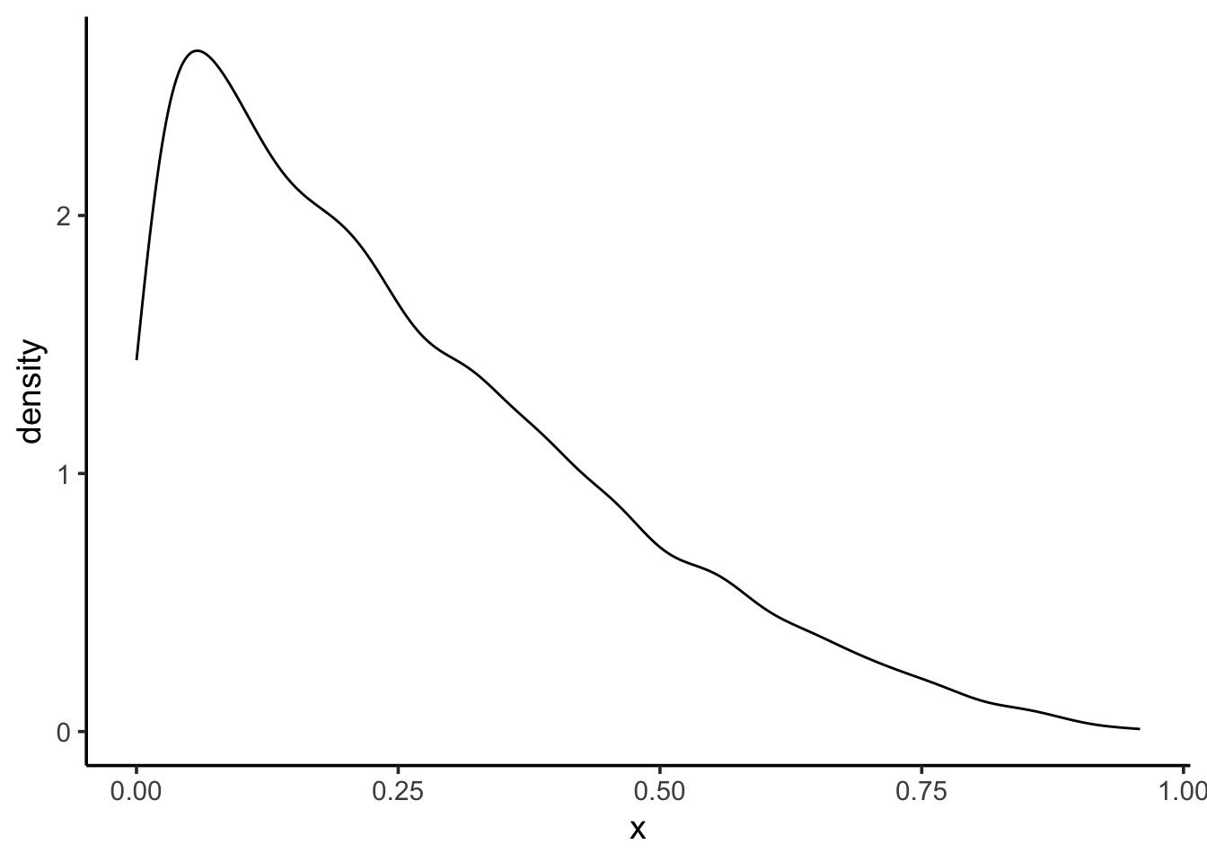
Code
PI v. HPDI for a Skewed Distribution
       25%        75%
0.09251207 0.37267543 |0.5 0.5|
9.248308e-05 2.082650e-01 PI v. HPDI

Code for HPDI and PI
# to get distributional properties
dens <- density(samp_bad)
hpdi_50 <- HPDI(samp_bad, 0.5)

#properties
interval_dat <- tibble(
  prob = dens$x, # parameters
  dens = dens$y/sum(dens$y), #standardized density
  quant = cumsum(dens), #quantiles based on std dens

  # use the quantiles for the PI
  pi_50 = ifelse(quant >= 0.25 & quant <= 0.75,
                 dens,
                 NA),

  # use the values from the HPDI for filtering
  hpdi_50 = ifelse(prob >= hpdi_50[1] & prob <= hpdi_50[2],
                 dens,
                 NA)
) |>
  tidyr::pivot_longer(cols = c(pi_50, hpdi_50))

## Plot!
ggplot(interval_dat,
       aes(x = prob, y = dens)) +
  geom_line() +
  geom_ribbon(ymin = 0, aes(ymax = value),
              fill = "darkgrey") +
  facet_wrap(vars(name))
So which interval to use?
- Usually, they are quite similar
- PI communicates distirbution shape for parameter
- HPDI matches more with the mass of the parameter that is consistent
with the data
- BUT - computationally intensive and sensitive to # of posterior
draws
- If the two are very different, the problem is not
which interval type to use
- It’s in your model/data! Buyer beware! SHOW YOUR POSTERIOR!
Which Point Estimate: Mean, Median, Mode?
[1] 0.636778[1] 0.65[1] 0.71Applying a Loss Function!
- Well, let’s think about the cost of getting it wrong!
- Assume a point estimate of d
- The cost of being wrong if using d is:
\(\sum{posterior * \left |(d-p)\right |}\)
- Could have also squared or done other things depending on cost of
being wrong
- Can apply this to chosing \(\alpha\) and \(\beta\) in frequentist stats!
Linear Loss Function Says Median (it’s close)!
# what is the cost of a given value being wrong
# for any parameter - linear addition
loss_fun <- function(d) {

  dist_from_each_hypothesis <- abs(d - grid$prob)

  scaled_distance_by_posterior_prob <-
    grid$posterior * dist_from_each_hypothesis

  cost_if_parameter_is_wrong <- sum(scaled_distance_by_posterior_prob)

}
Linear Loss Function Says Median (it’s close)!
# iterate over all parameters
loss <- sapply(grid$prob, loss_fun)

# and the point estimate with the lowest cost is...
grid$prob[which.min(loss)]
[1] 0.64[1] 0.65Choosing a loss function
- Usually the mean and median will agree
- If the cost of being wrong is higher, go with the mean
- If this is a big problem, or big discrepancy, problem might be
deeper
- Examine your posterior! All of it!
Using your samples for model checking
Model Checking - Why?
- We’re in Simulation land
- A lot can go wrong do to small errors in our model
- A lot can go wrong because of big errors in our model
- Maybe our software failed (i.e., convergence)
- Maybe our sampling design cannot produce valid estimates
How do you check models?
- Did you reproduce your observed summarized data?
- Did you reproduce patterns in your raw data?
Simulating from your Posterior
- Make random draws using your sampled parameters
 w    n percent
 0   10  0.0010
 1  124  0.0124
 2  336  0.0336
 3  780  0.0780
 4 1282  0.1282
 5 1754  0.1754
 6 1972  0.1972
 7 1858  0.1858
 8 1311  0.1311
 9  573  0.0573
Simulating from your Posterior Sample
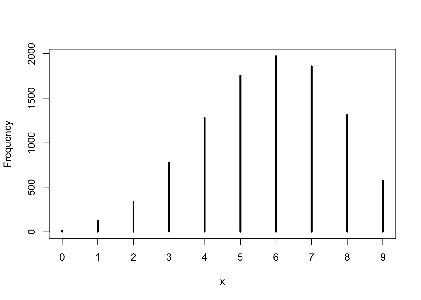
Note that 6 is the peak, and our draw was w=6!
Getting Fancier with Checking
- We drew W,L,W,W,W,L,W,L,W
- Can we reproduce 3 Ws as the longest run?
- This will require fancier use of the posterior to simulate order of
observations
- See slide code - but, this empahsizes the subjective nature of model checking!
So, reproducing longest runs of W
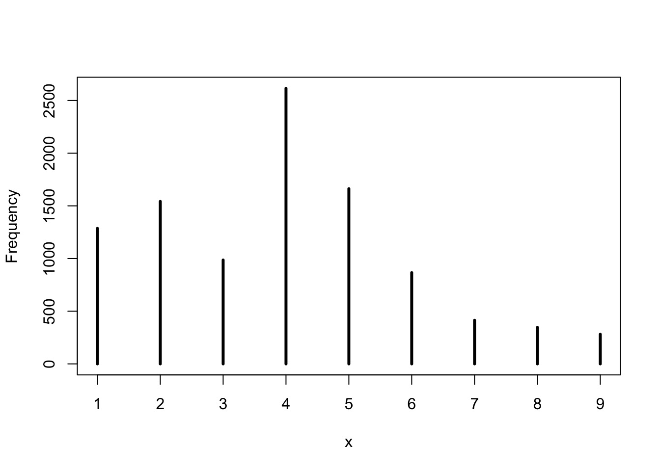
We had many 3s - not bad, not spot on - is this a good model or check?
Code
getRuns <- function(prob, draws=9){

  # toss that coin with a probability!
  toss <- rbinom(draws, size=1, prob)

  runs <- rle(toss) # gets run lengths of all values
  runs <- runs$length[runs$values == 1] # filter to 1

  # return 0 if all L, otherwise
  # return the longest
  if(length(runs) == 0){return(0)}
  max(runs)
}

# iterate over all samples
samp <- samp |>
  group_by(samp) |>
  mutate(longest_run = getRuns(samp)) |>
  ungroup()

simplehist(samp$longest_run)
Your Model is a Simlating Golem!
- We can do a LOT with a simulated posterior
- We can explore intervals and shape to create
inferences
- We can explore intervals and shape to validate our
model
- Using posteriors to generate random numbers means
we can explore
- If our model TRULY matches our data
- Large-world relevance (external validity)
- Future implications of our model
- None of this is arbitrary statistical tests